The following case study will dive into the challenge of elevating a brand through the implementation of its assets by users of various backgrounds in a decentralized workforce.
A loaded statement right? This is the complex challenge facing CU Denver but with the proper approach can be solved. Creating branding standards has often been the solution for this type of problem, however standards alone do not promote true brand adoption and application.
CLIENT
CU Denver
YEAR
2019
ROLE
Creative Director
UX/UI Designer
01
BACKGROUND
The university continues to ask many users to take on design and branding internally with little background in those areas. Designing a solution that worked for different backgrounds and knowledge bases was crucial for a universal implementation.
Through various research methods and user touch points, it was discovered that the solution needed to provide guidance, encouragement, and quick access to assets to be a useful tool. Throughout the project, there were frequent check-ins with users to gather feedback on both empathy and usability. The end result brings together a multitude of access points, functionality and cross references that were previously spread across different platforms or unobtainable.
02
THE PROBLEM
Throughout the University of Colorado Denver campus, within the schools and offices, materials are being produced that do not look cohesive or put our best foot forward. At the root of this issue is poor implementation of our brand assets and overall design.
Students and staff throughout the university often find implementing design elements and branding to be a challenge. It is a constant struggle which leads to inconsistency and ineffective materials which begs the question:
“How might we share information around our assets and the guidance to apply them to help develop a more unified brand”
?
Tackling The Problem
Through the combination of qualitative and quantitative research outlined below, I was able to capture a wide range of views, opinions, best practices and possible capabilities available.
Qualitative
What is a “well designed” piece. The answer will be opinion based. I’ll set up interviews to learn more about the users (marketing directors, brand ambassadors, other communicators) opinions around this topic.
Secondary
Research what are our competitors doing and how are they are solving similar problems. I’ll also look into how corporations roll-out and guide branding. Lastly, I’ll look into educational resources and systems to see what tools currently exist.
Generative
Learning more about the users’ beliefs, backgrounds and training will help frame the problem.
Quantitative
What stats/user behaviors back up the above opinions (looking into users actions, applications, and preferences) adoption of the tool.
Market
Interviewing a specific audience and gathering their thoughts towards how they use resources will help define how the “tool” will be used.
Evaluative
Testing the usability of the design will be important in the success of the adoption of the tool.currently exist.
03
a better understanding of the problem and the audience
Empathy with stakeholders
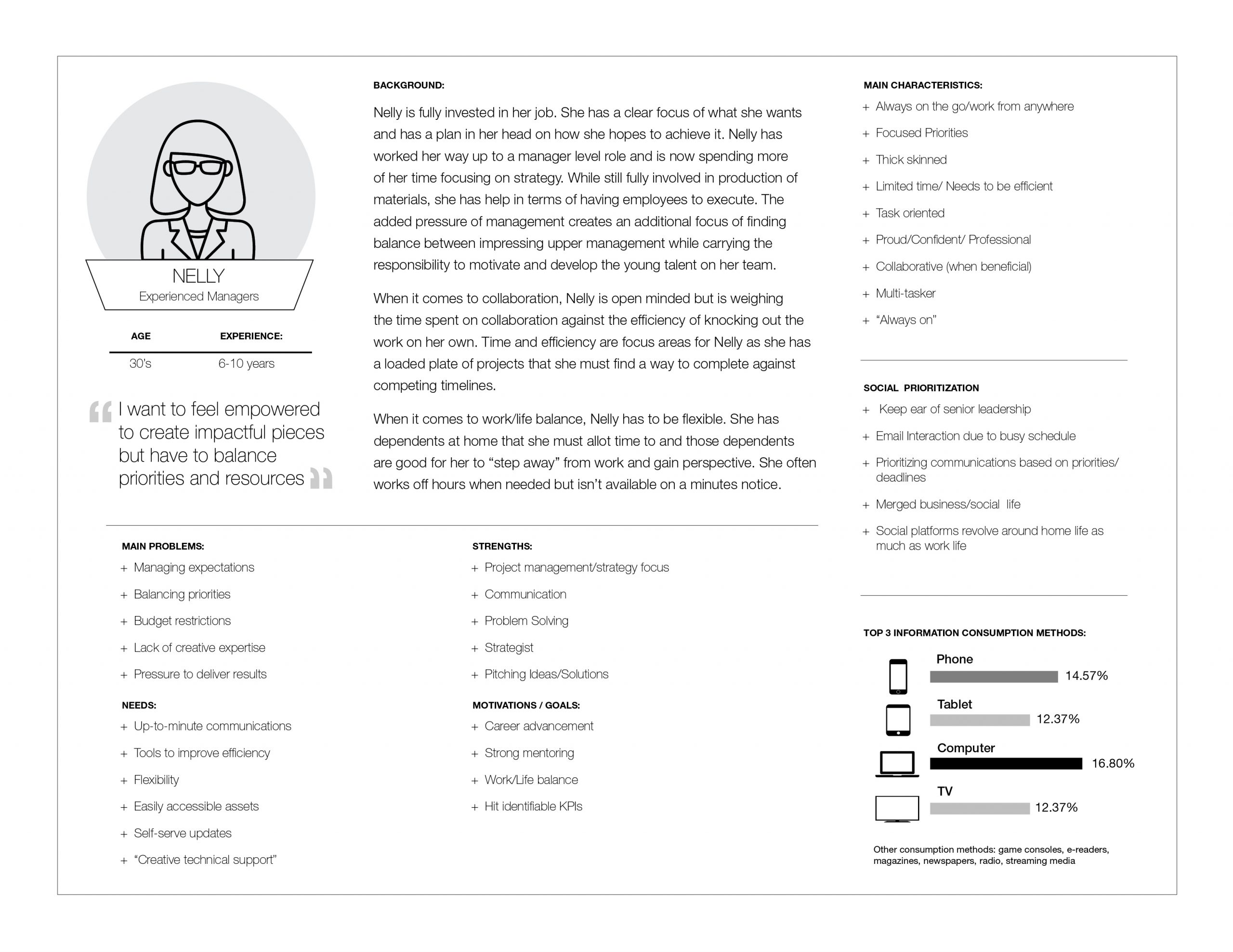
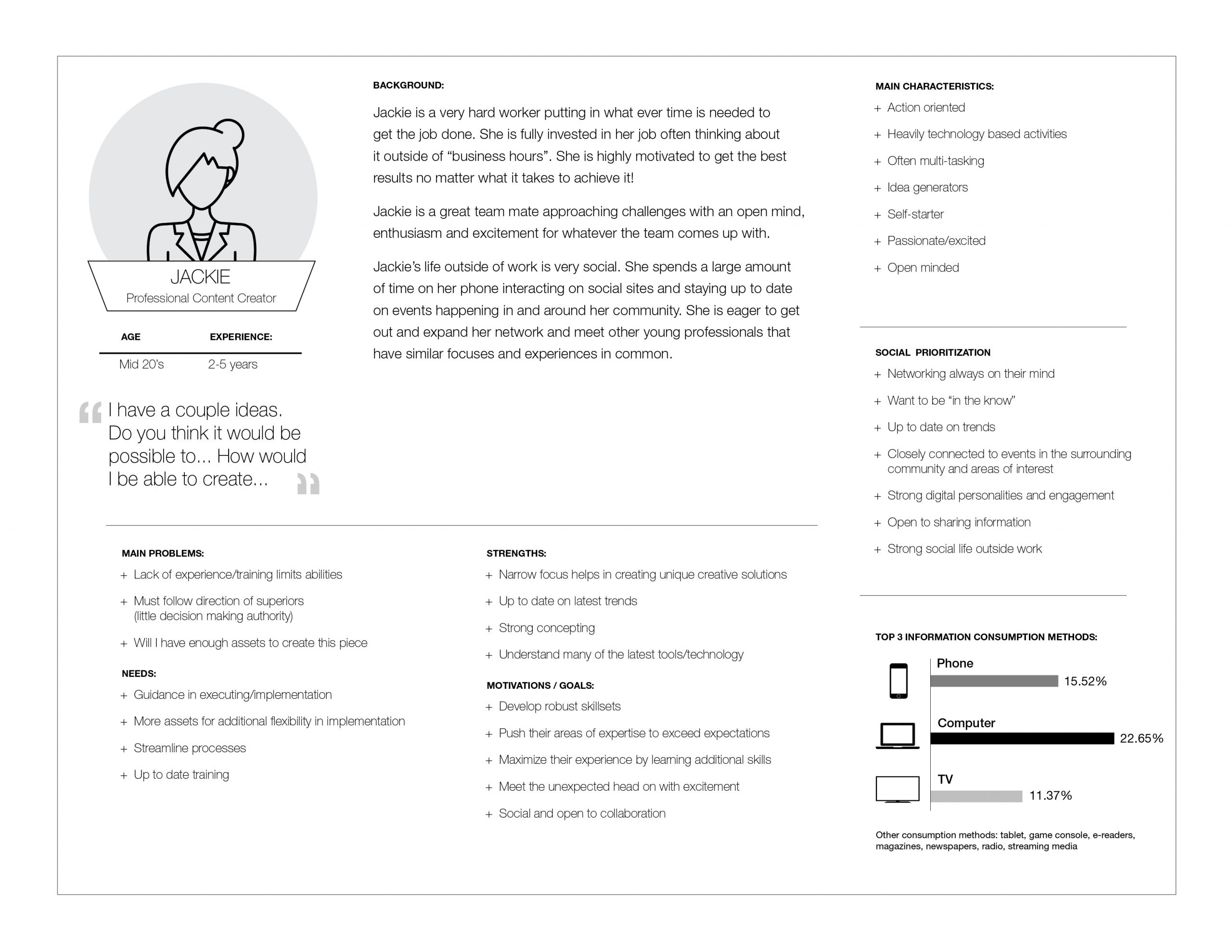
Stepping out of my design background to better understand the stakeholder through their eyes helped push me towards solutions that best matched their needs. One on one interviews and a larger stakeholder survey helped highlight more specific issues surrounding the problem but also identifying opportunities moving forward. The majority of stakeholders have great pride in their work and the university they work for.
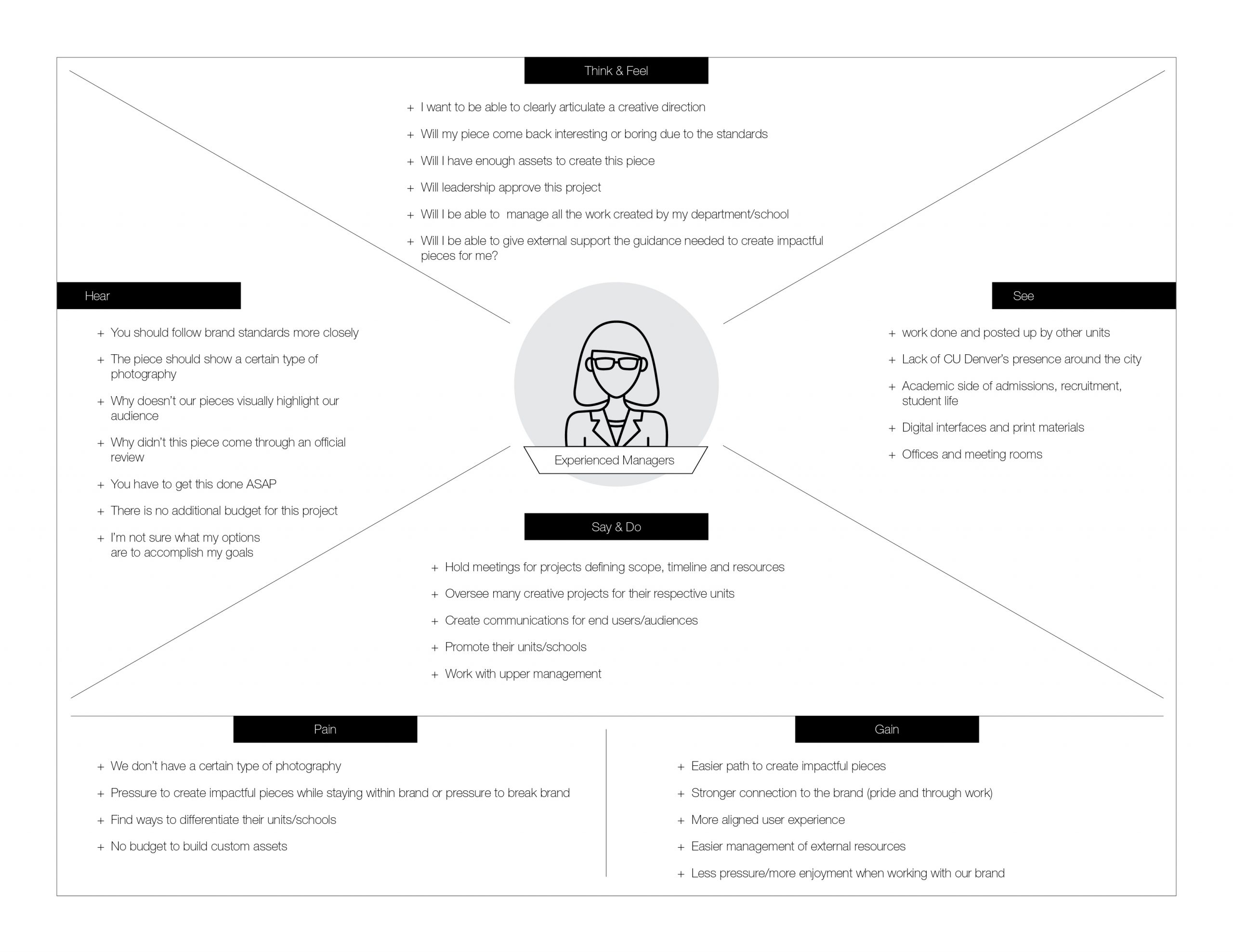
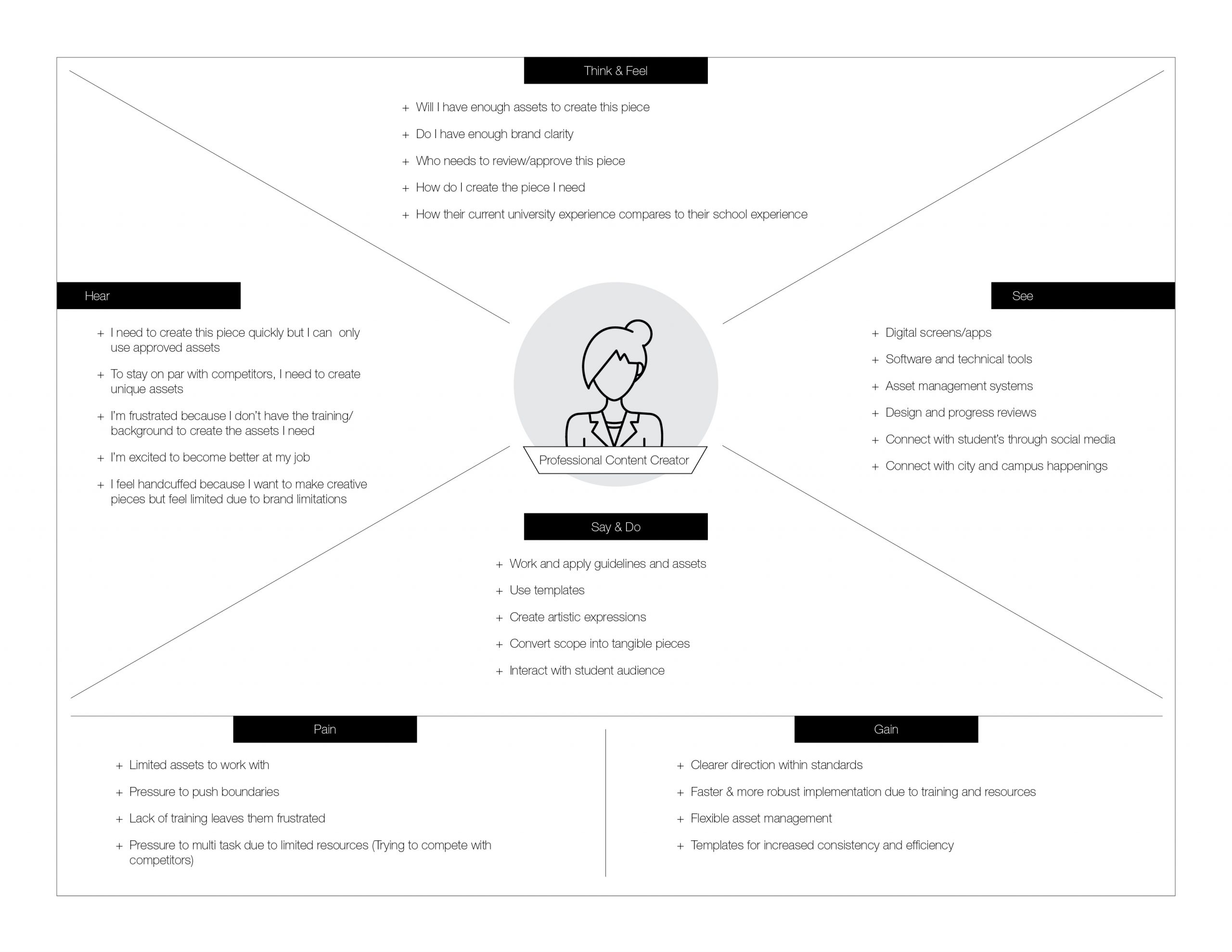
With the various backgrounds, experience levels, and roles, creating personas and an empathy map was an important distillation to help focus on the key aspects that are the most impactful for the stakeholder audience.
After completing this phase there were a couple findings that surprised me.
There was an overwhelming desire to learn, grow, and develop in the area of design and brand. Stakeholders just needed guidance, training and the proper tools. They also were seeking encouragement and validation.
From a best practices standpoint, there is no all around fix to this problem that can be implemented. With that said, my focus for phase two will be to establish a solution that makes these challenges easier knowing that there will have to be an educational component that accompanies the tool itself.
04
Looking at a problem as an opportunity for a great solution.
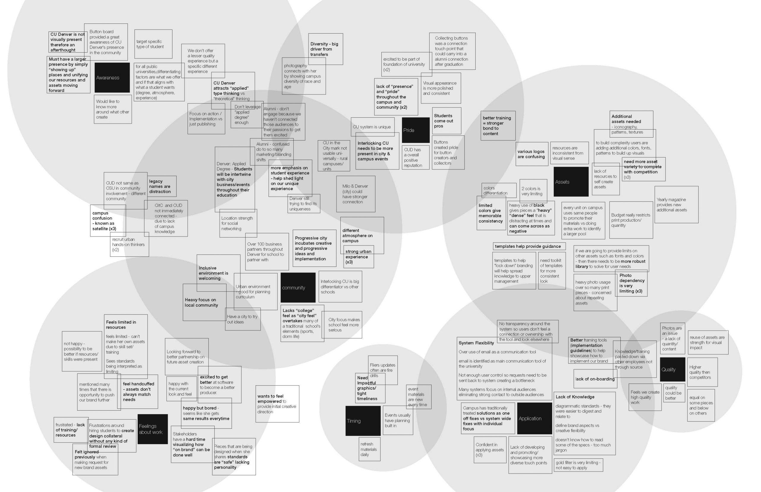
With a better understanding around the users, I could start brainstorming and then cross-check ideas against my personas for possible solutions. The first stage of my exploration was to chart out my finding from phase 1 through an affinity map. While I had some initial thoughts, this process would match up what users were saying with my perceptions walking out of the interviews.
AN AFFINITY BOARD OF RESULTS
The affinity map not only helped me form connections around similar information but as shown in the gray circles, it helped me visualize the overall impact of each topic as well as overlap between topics.
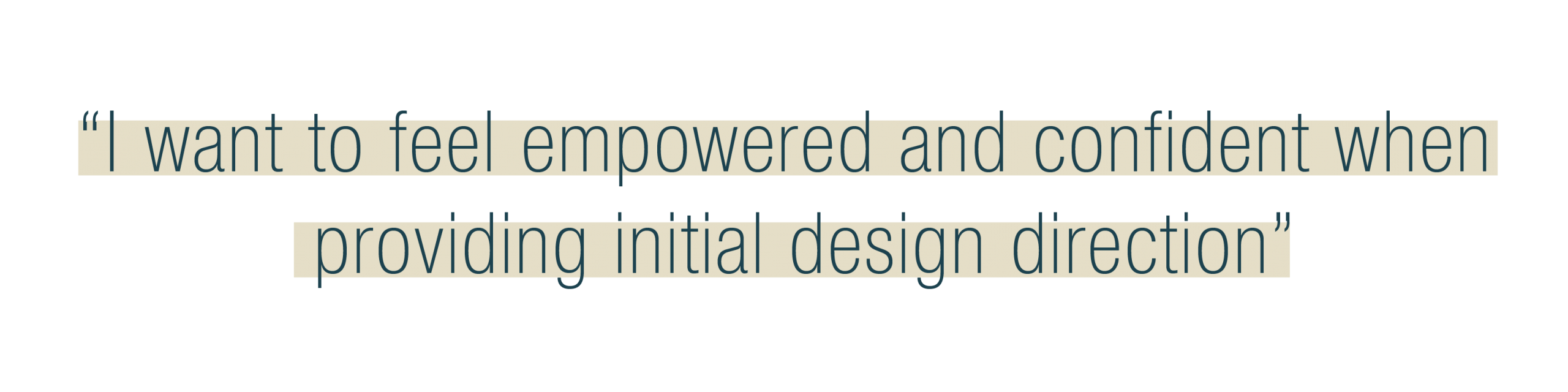
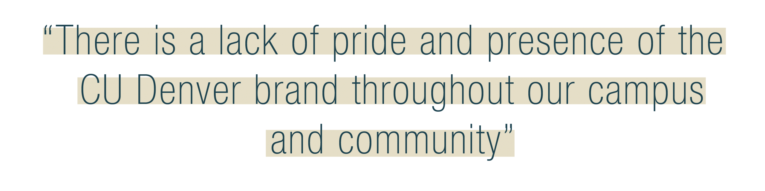
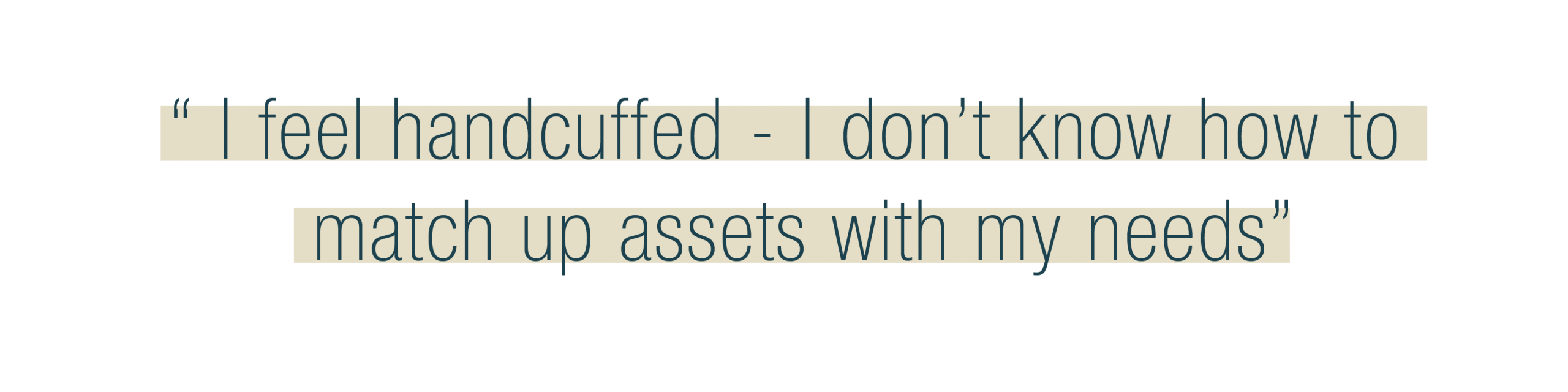
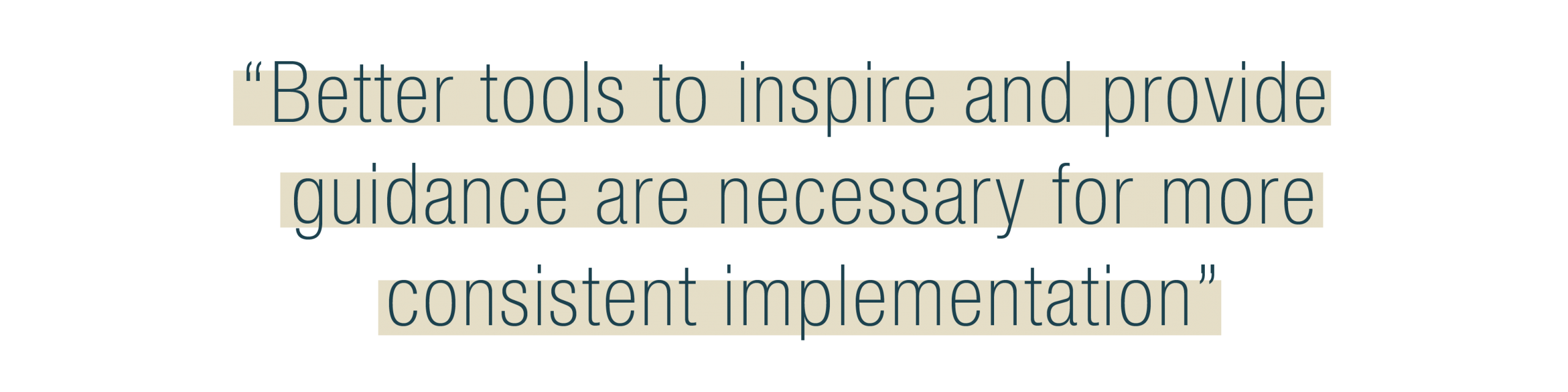
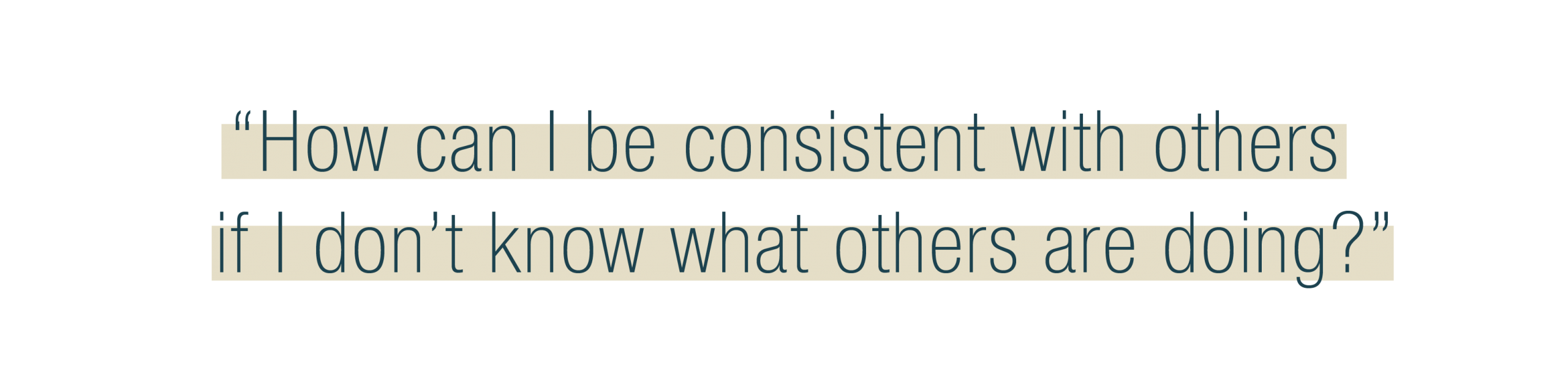
Notable Quotes
These quotes help sum up my findings from phase one incorporating both the qualitative and quantitative.
Brainstorming
After filtering out the most important takeaways from meeting with users, it was time to turn these into insights – converting problems into solutions. I set off asking myself two questions, the first aligning with my problem statement. “How might we spread resources to grow and develop a unified voice through brand adoption and application.” While this question did spark some good ideas, they were mostly design oriented filled with jargon and technical approaches which seemed to be missing the empathy side of the equation. For that reason I switched the question to, “Help people see through my eyes by me first seeing through theirs.”Knowing many of my users had little to no design training, I needed a solution that helped them see project as if they had. I went back to how I learned to design by mimicking pieces I saw that I thought looked good, then through research and repetition I was able to build my skill sets and knowledge. By giving users examples to inspire and a look at what can be made, they will be more likely to create their own pieces. By seeing the possibilities, they should feel less overwhelmed and more encouraged to create.
reflection
This phase was a rewarding one for a project that started as what looked like a technical solution has turned into one of personal growth for me by supporting and training the personal growth of others.
I did feel there were missed opportunities in this phase in terms of collaboration. Ideas grow and flourish with collaboration and due to the timing of this project, collaboration wasn’t an option. While I think the solution is a solid direction forward, I will continue to wonder how much farther the idea could be pushed. Luckily this is a solution that can continue to grow and adapt as time allows. educational component that accompanies the tool itself.
05
The Solution
As the project rolled into the development phase, the next step was to unpack the solution discovered above into the details of executable action items such as what does this app offer, how is the information organized to optimize user journeys, and what resources will be needed/available to include.
2 part Solution
The app outlined below brings together a 2-part solution. It is meant to be both a reference and teaching tool to help show users how to create and effectively use brand assets. The app creates a visual way to look through guidelines and get a better understanding around recommendations by pairing the guidelines with use cases. It also provides multiple access points wither the user is looking for something specific or just looking for inspiration.
Part 1
Integrate examples with assets
By giving users examples to inspire and a look at what can be made, they will be more likely to create their own pieces. By seeing the possibilities, they should feel less overwhelmed and more encouraged to create.
Part 2
Coaching
Through empathy for different user groups, find the touchpoints important to each group and explain how our brand and design systems are working to elevate those touchpoints through visual and information hierarchy.
IA development
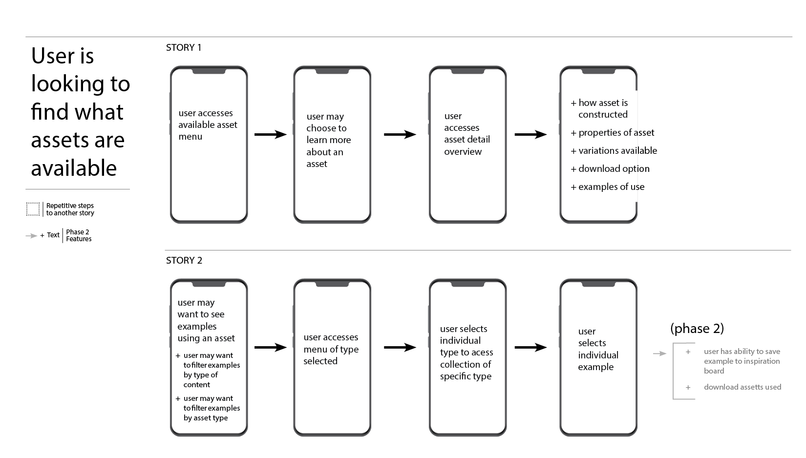
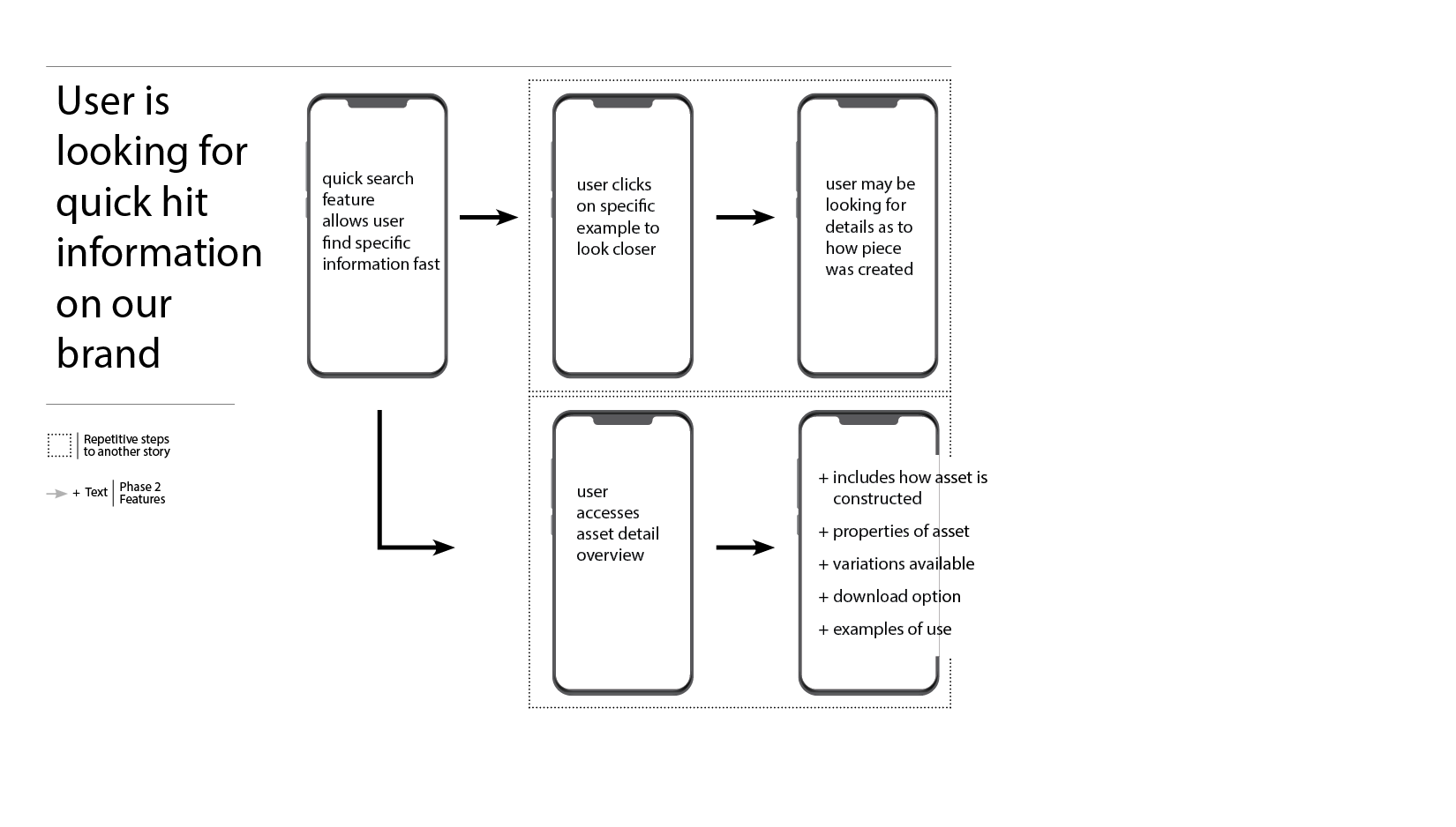
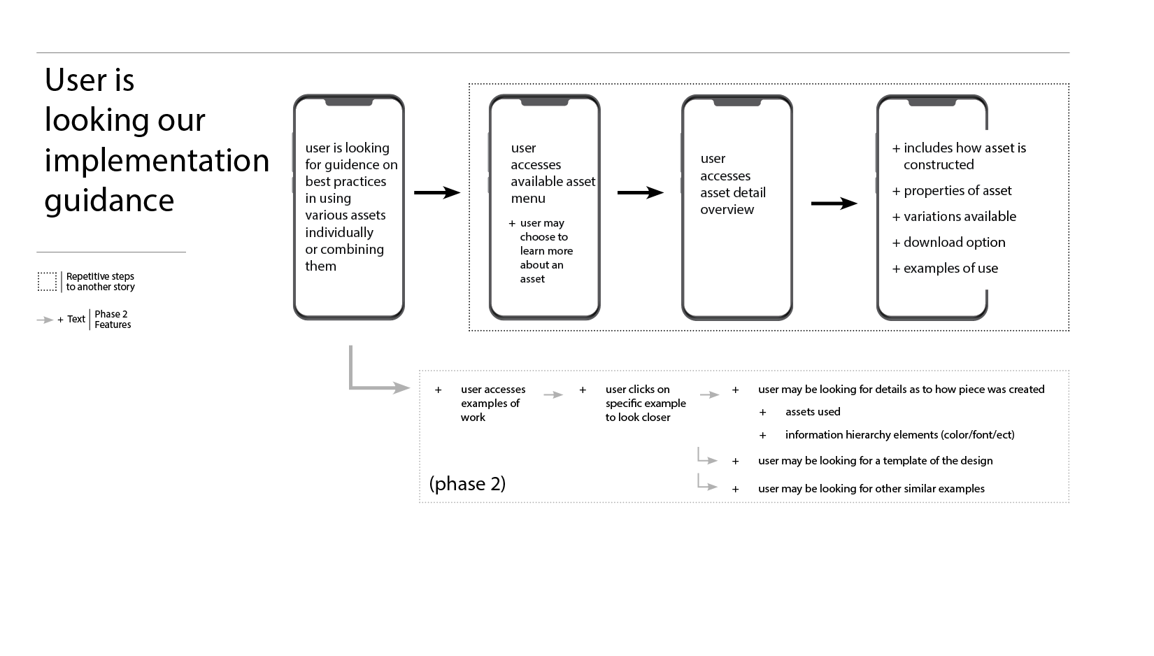
User Journeys
User stories and flows helped identify 2 key aspects of the project. First and most important was the analysis and planning around user journeys; when and how would users want to use this app. Secondly as a user progresses through the app do they always know where they are, do they ever hit a dead end or is there always a way to keep exploring?
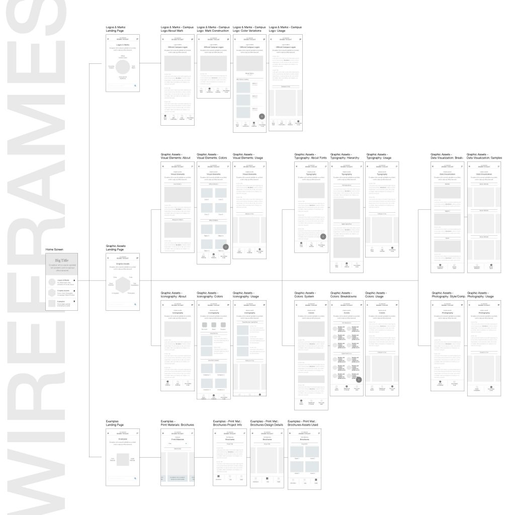
Site Map
Taking the stories and flows from above, the site map helped to organize the experience. Identifying what info should be included on each page based on what users were looking for in their stories allowed for a seamless experience. The flows added the additional details of when CTAs and other actionable items should be included on a page. In addition they helped linking within and between the different sections of the site.
UX/UI Development
User Testing
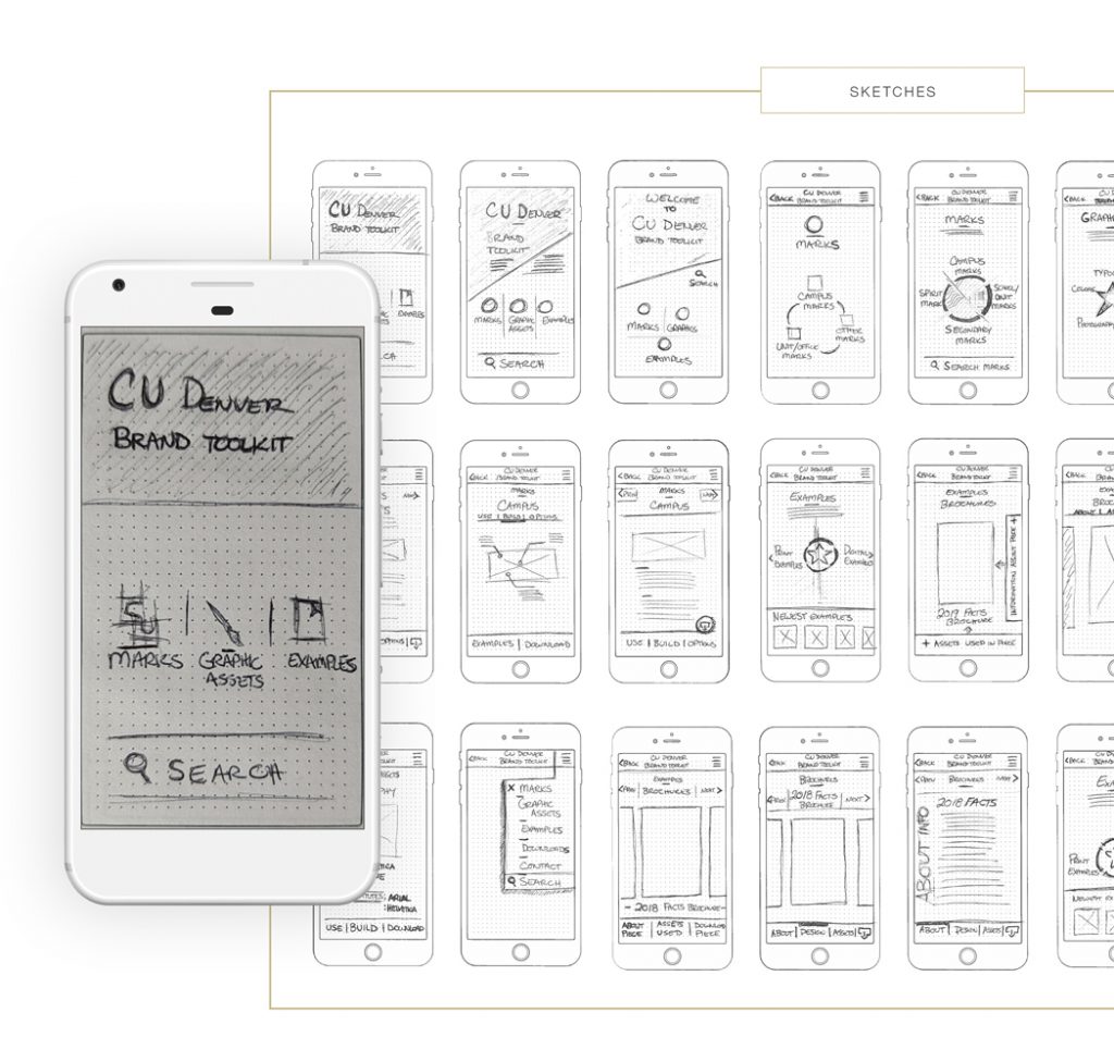
Through multiple rounds of sketching and an eventual low fidelity wireframe for guerrilla testing, I was able to develop out the initial details of the app. Guerrilla testing further advanced the development of the navigation and highlighted a couple features that would be helpful for users if added.
Design & iteration
The app itself needed to represent the possibilities that users were capable to create using brand elements as well as housing the information and assets within it. With dark heavy backgrounds and solid clunky iconography used in the past, I wanted the look and feel of the app to represent the lighter/airier side of the brand. It was key both for the brand and app to show users that the brand can be implemented in ways that provide a modern look while fading into the background allowing the work and information to shine in the foreground celebrating their hard work and research.
Prototyping
Below are some of the high fidelity wireframes created to present to leadership for final approval and to kick start the next phase of the project-the actual build.
Next Steps
Next steps on this project are two fold – a 4 month plan to build the actual platform for users to start using as well as a 12 month plan to build out many of the additional assets not currently available. I will lead both phases working side by side with developers to breakdown the concept into sprints as well as work with my design team to develop the assets that still need development. The goal of this project was not only to provide stakeholders with a robust implementation tool but to also show my peers on other campuses what a holistic, user-centric solution could look like and the benefits to empowering and training your stakeholders vs policing them on branding and design. The long term goal is in the next couple years, the system is managed and populated by the stakeholders vs the design team.