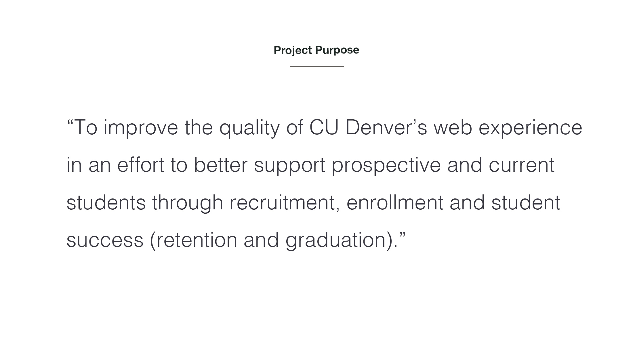
CU Denver main .edu site has always targeted perspective students to help drive admissions for the university however the site and its supporting sites were set up based on organizational structure vs how its users search for information creating a poorly functioning series of websites. In addition, none of the sites talked to one another so tracking user journeys became impossible without assumptions. Lastly there was a bad habit of repetitive content throughout sites as they were managed by departments vs a central unit which caused SEO to suffer as well as adding confusion to users for identifying the most current information.
CLIENT
CU Denver
YEAR
2020
ROLE
Strategic Advisor |
Head UX/UI Designer |
Site Build Manager
Overall Scope
Research and discovery of site ecosystem, update ~50 page main site, SEO build out, and co-ordination with over 20 other microsites
Resources
Research: Outside Agency
Build: In-house team (1 UX designer, 1 developer, 2 content writers, SEO expert)
SEO Set up: Outside Agency/In-house team
Timeline
Overall: 1 yr
Research: 5 mo
Build: 2 mo
SEO Set-up: 5 mo
Process
CU Denver hired an external agency to conduit the research and discovery phase of the project and to do some early user testing around the development of a new IA and site structure. From there, I co-lead the internal team to design and build the site and co-ordinated with others on over 20 tertiary site builds that happened in unison to create a better overall user journey. Form there we refined many areas of our SEO and SEM that was not previously possible.
End Product
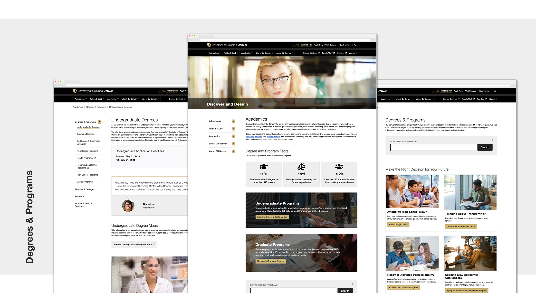
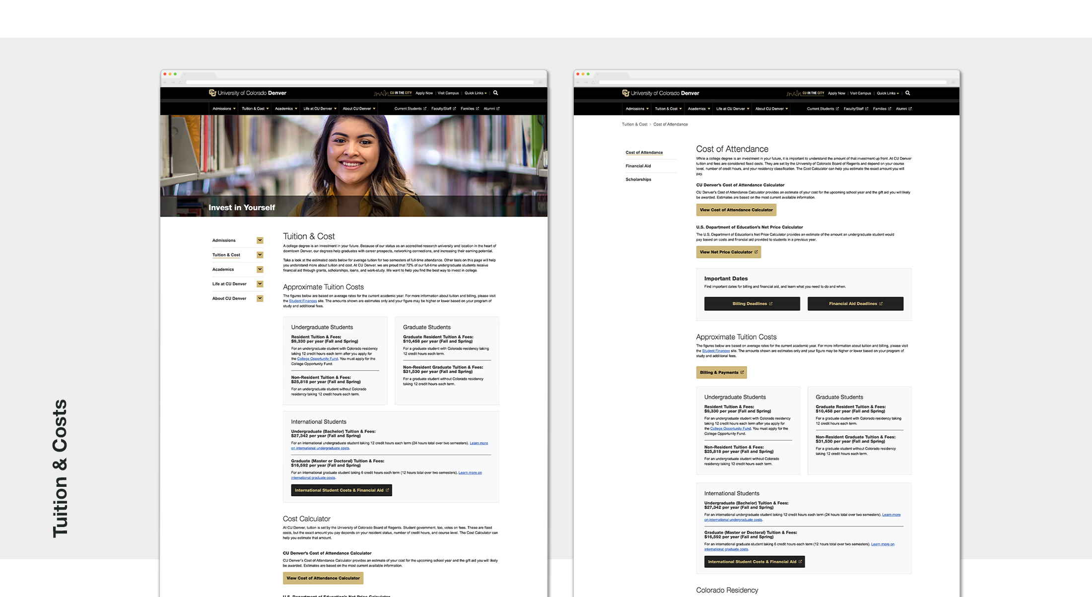
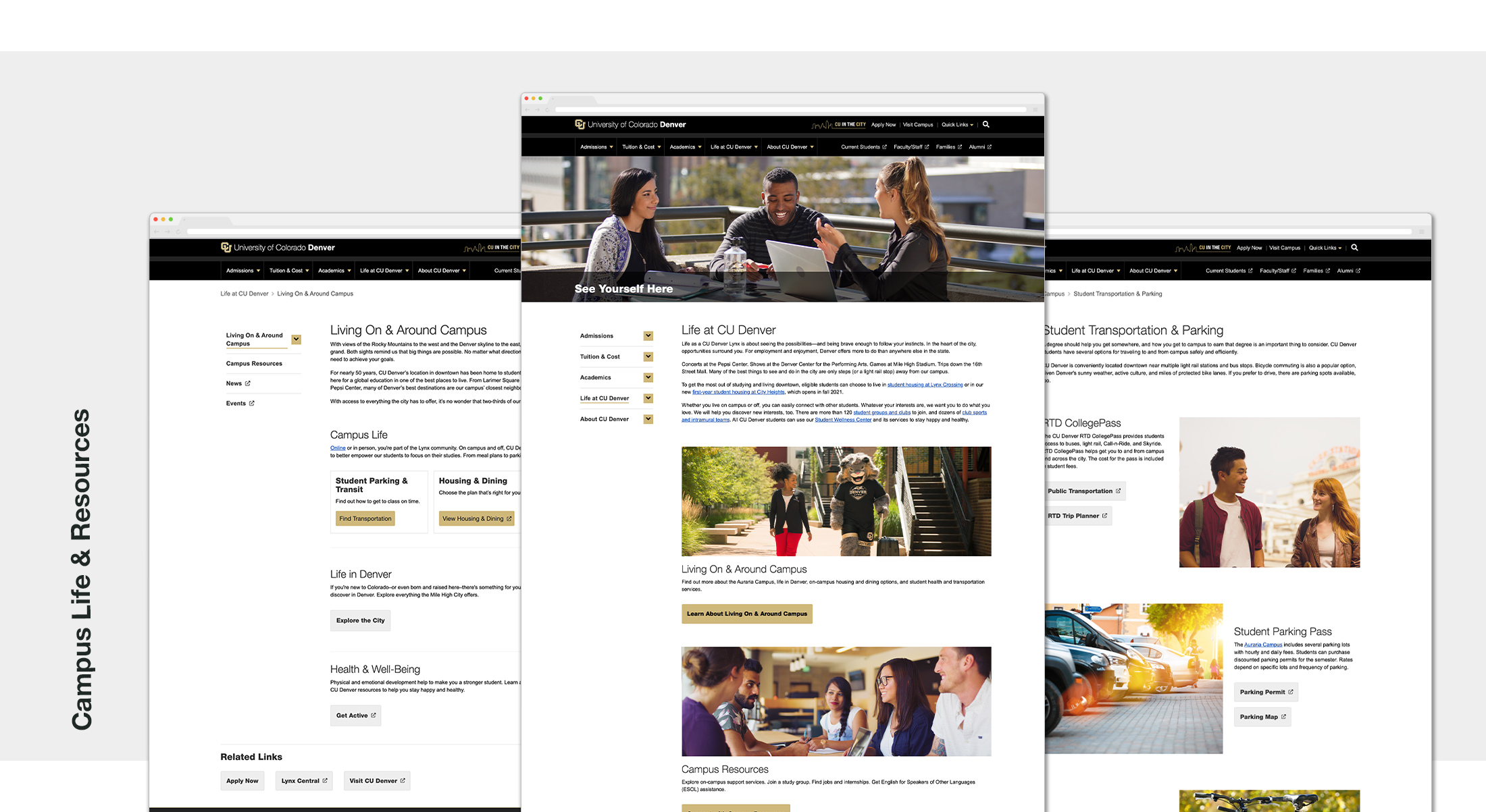
New ecosystem of sites focuses on prospective students (main university site), new current students (resource hub), and a revamp of over 20 central service microsites (such as admission sites, finance sites, ect.) Below you will see the results of the main site as that was my main focus.
Key Additions/Focuses of New Design
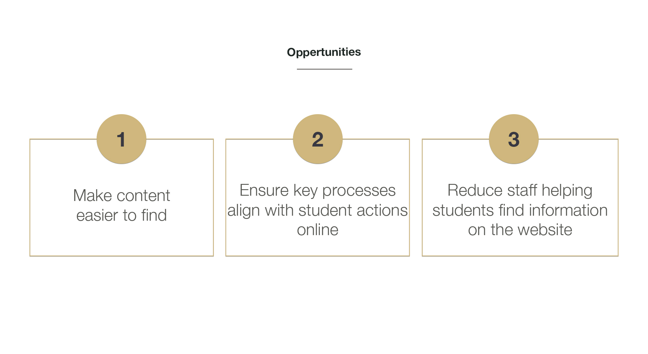
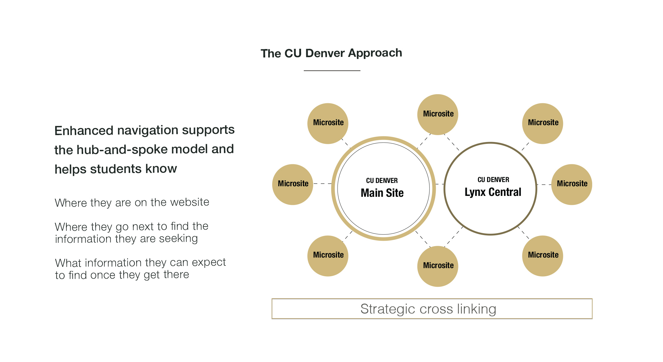
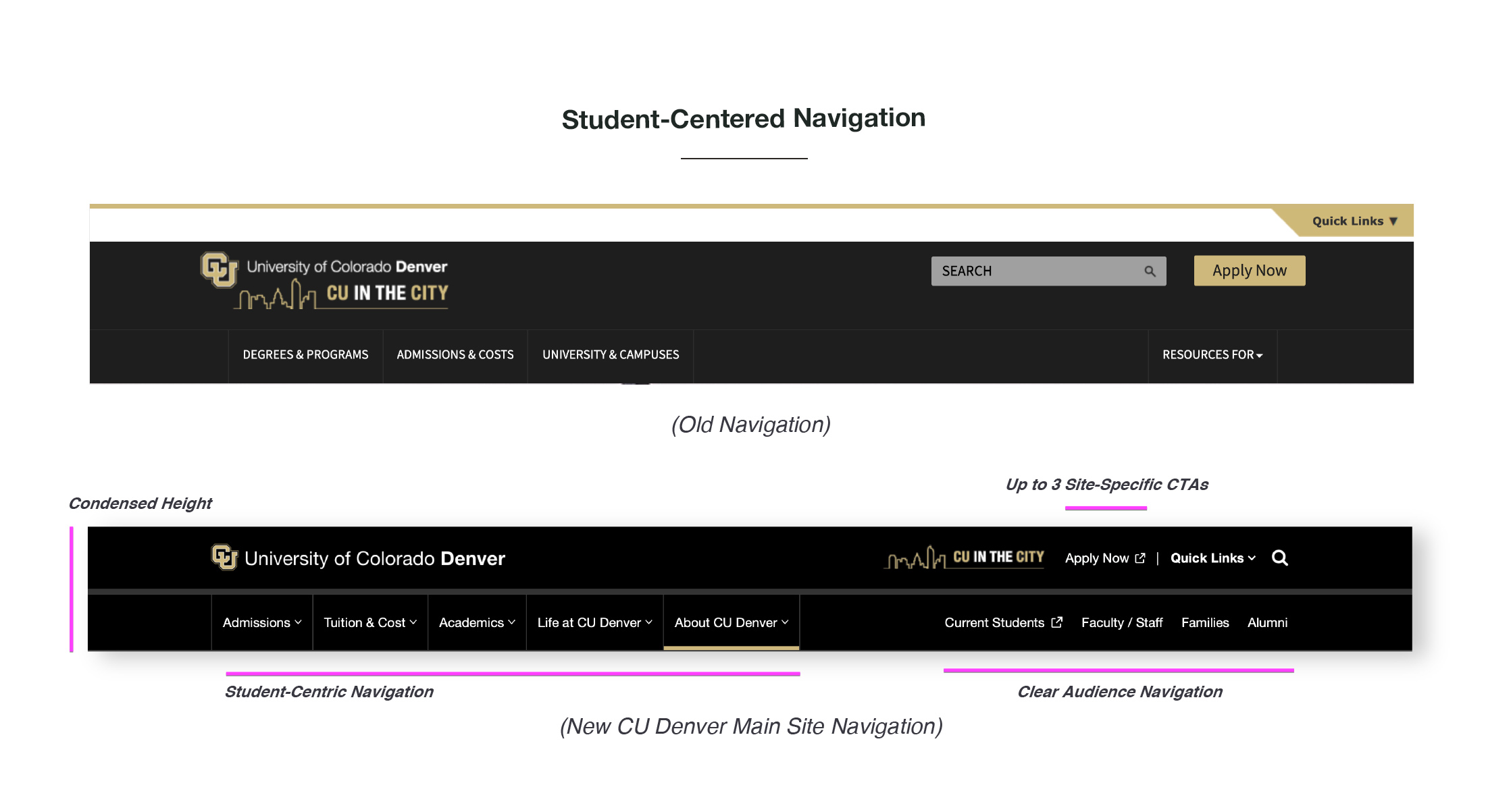
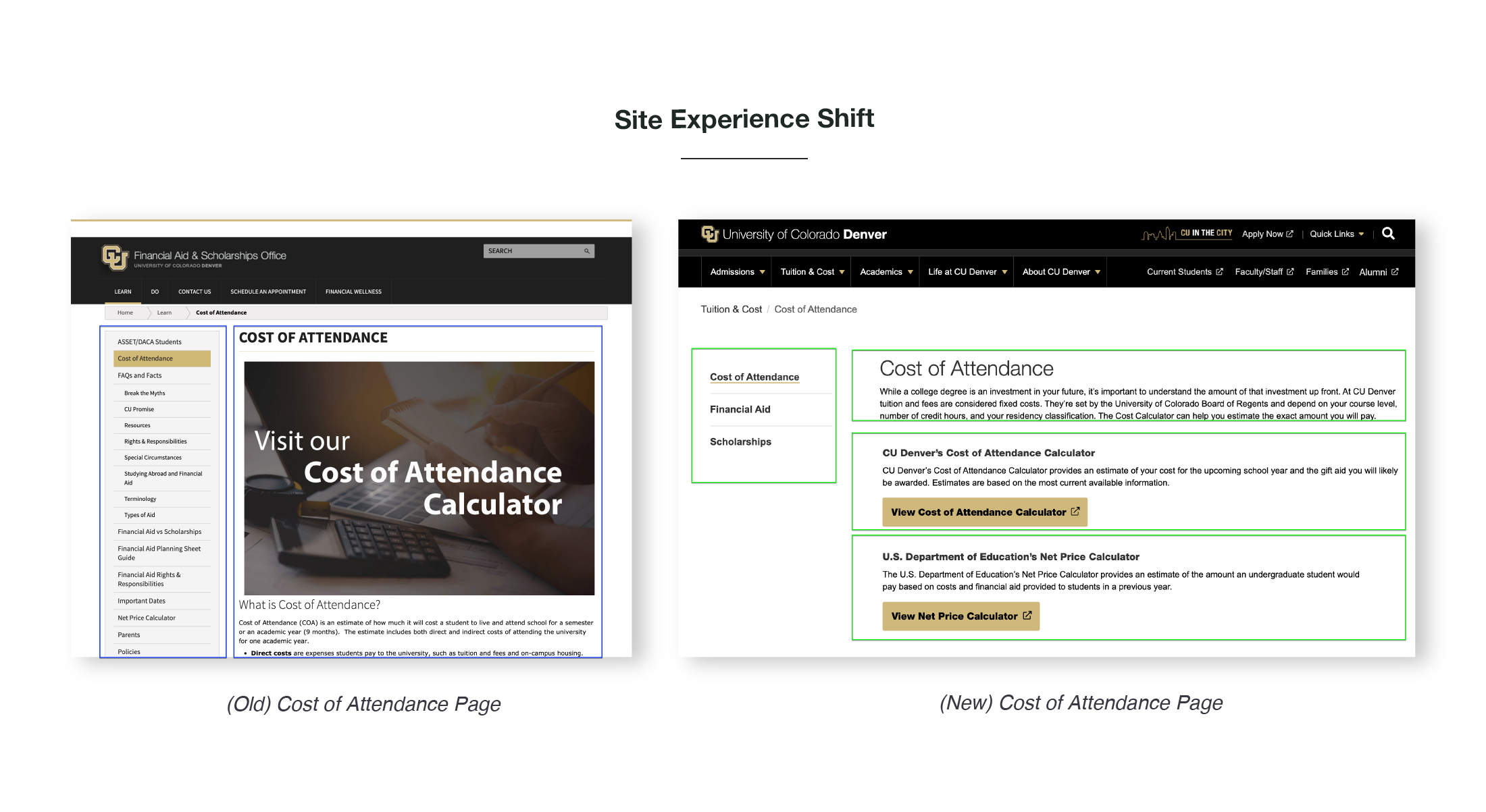
The biggest updates to the site were to reorganize the content to reflect how our audience was looking for it as opposed to mirroring the university’s organizational structure. Secondly was to create a unified back end to the site and accompanying microsites to gain better insight into user journeys.
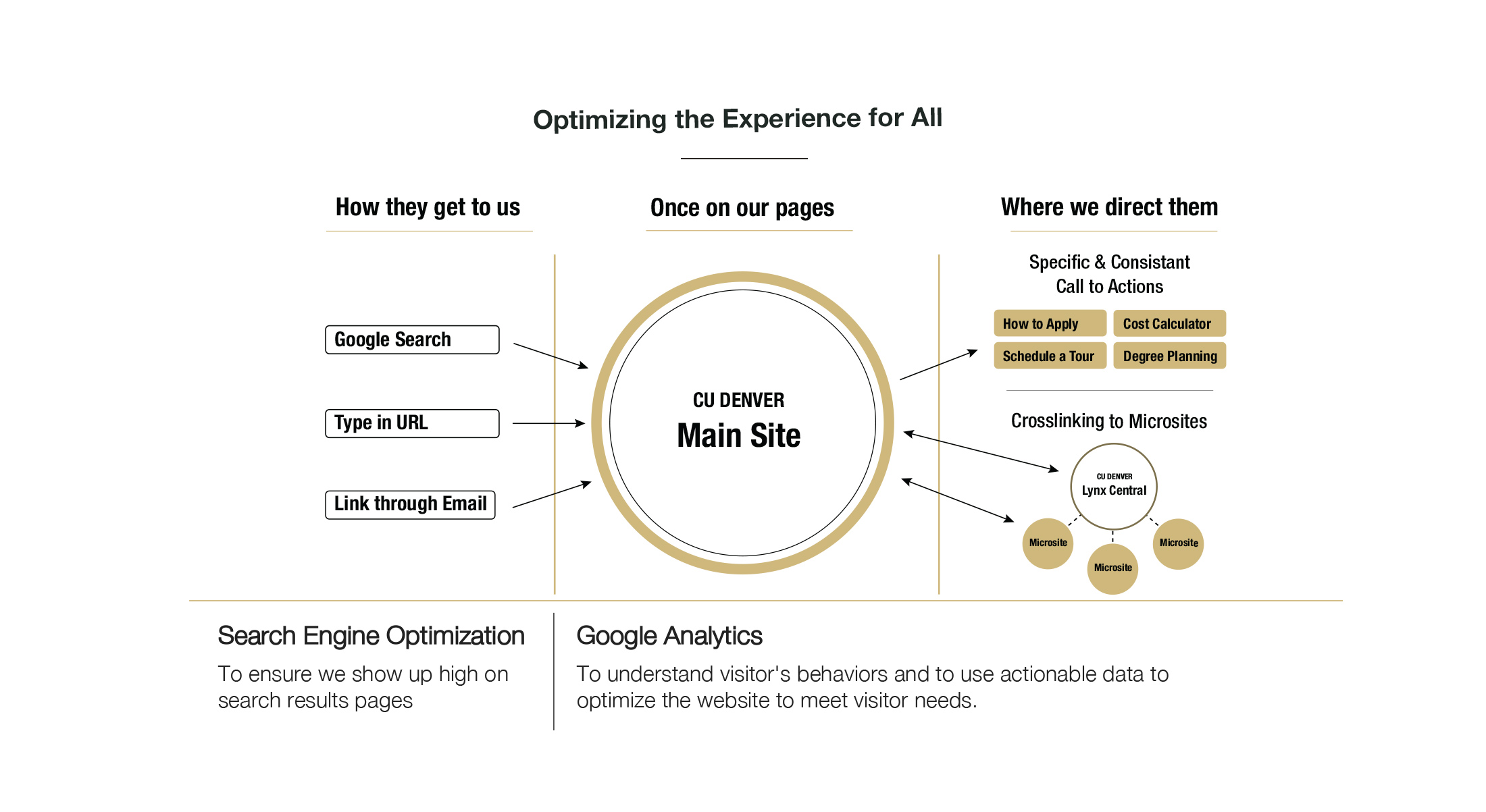
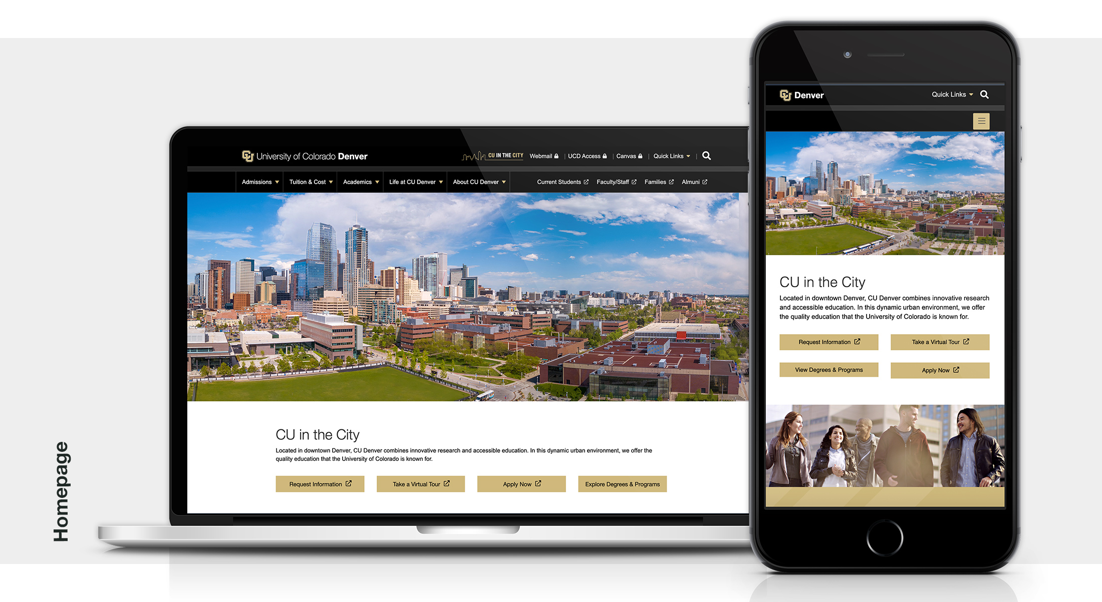
We sought to highlight the most seeked out information for the prospective student audience such as degrees offered, visit campus/take a tour, and apply. All these actions are also revenue drivers for the university.
We elevated CTAs bringing them higher up on pages and visually highlighting key pathways to allow users to more quickly navigate through the site.
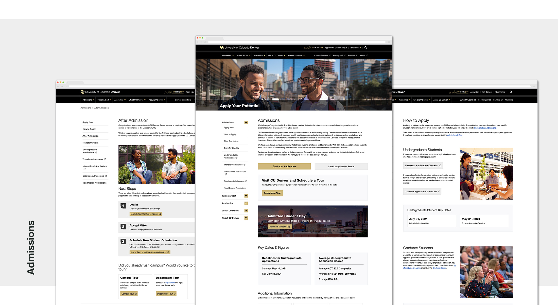
We provided key information missing on the previous sites such as deadlines and typical costs for different types of students
Overall we created a home base that crosslinks to important student admission information and provides additional tools to aid students in the application processes such as degree maps, tuition calculators, and additional resources. The cross linking eliminates the need for repetitive information.
REsults
While benchmarks are currently being set there are positive signs of engagement:
Early Metrics
Bounce rate for the homepage has been reduced by 40% down to 14%. Bounce rate on other pages have similar results.
We’ve seen a higher usage of our online tools like cost calculators, and visits to pages such as tours.
There is high engagement with apply now CTA’s and promotions such as Free App Days converting to application submissions.
We’re gaining a clearer understanding for incremental improvements to drive better engagement in the future.
Stakeholder feedback
Congrats to you and the team for the great work on the website. It’s a substantial upgrade that will serve students and the campus well. Nicely done!
Vice President of Comms, CU System Office
That was a home run! Please pass along my congratulations and enthusiasm for the transformed website and it’s future impact on student success.
CU Denver Senior Leadership Member
That was fabulous! The thoughtful work that has gone into the design and development of the new website is stunning. And the way that it will support and elevate the work to create the UNPARALLALED student experience will truly be transformational. I’m so proud of you and can’t wait to visit the new site next week. Many thanks for all you’ve done to polish CU Denver’s shine!