Website Redesign

CU DENVER NEWS
& CITY STORIES

1 site: 2 different audiences

City Stories provides a glimpse into the lives, research, and creative work of the students, faculty, and alumni who are making an impact that extends beyond the CU Denver campus. Targeting external business leaders and influencers, these stories of impact help to demonstrate and bolster CU Denver’s position as a vital community asset.


CU Denver News continues to be a highly used resource and the pulse for research and happenings around campus keeping internal audiences engaged with the university.

CLIENT

CU Denver

YEAR

2019

ROLE

Creative Director

UX/UI Designer

01

BACKGROUND

As part of the evolution of CU Denver’s brand positioning and messaging, there was a renewed focus on the university’s impact around their local community and the city they call home. With this shift , they now had a new audience to reach – business leaders and influencers. One of the key communications channels to reach this audience was through the university’s news site which currently was geared towards internal audiences of faculty, staff and students. Adding in external audiences wouldn’t work with the sites current layout and functionality yet it was a highly valued resource among the internal audiences.


The task was to improve the sites functionality while also expanding it’s reach. Serving up two different audiences and spanning content across both was a unique challenge. The user experience across the site and especially the information architecture was going to be key if this site was going to be successful.

02

THE PROBLEM

After through analysis of the site there were a number of areas that could use cleaning up such as repetitive information, broken user journeys, and a lack of compelling content however these are all secondary issues. First we needed to solve the main hurdle:

“How do we serve our audiences content they are passionate about? And how do we provide a valuable resource with a clean user experience to keep them engaged and coming back.”

?

Tackling The Problem

While we knew quite a bit about our internal audiences, there was work to be done to better understand our external ones. Below are some of the research methods we used to gain a better understanding around who we were designing for:

Market

What does our external audiences consider valuable resources for news and community impact? Is the university considered a valuable resource to them?


To find out we set up a series of focus groups to talk through the university’s current reputation, discover their interactions with the university over the years and discuss what they value as a resource and the role the university can play within that.

Quantitative

What resources do these external audiences interact with? Where are they spending their time and how much time are they spending? Are there areas of opportunity that align with the university’s goals?

Secondary

Research what are our competitors doing and how are they are solving similar problems. Sharing a campus with 2 other universities’ meant that we had to provide clarity around what makes CU Denver different.

03

Site Development

Now that we know what our audiences find valuable from a content standpoint and the tools they are most familiar with, we need to dive into the organizational, interactive and visual aspects of our site and development of details that they find intuitive and as engaging as the content itself.

Site navigation

As stated earlier, one of the key details to this site was going to be a clean and clear site navigation so no matter what audience or where a user enters the site, they are fully aware of how to navigate through the content.


The site navigation was unique for this site as it was in many cases a site within a site.. CU Denver News was the  main site which served internal audiences in the past and will continue to do the same in the future. One of the sites landing pages however was to be elevated as the main page for external audiences. Internal leadership also wanted this landing page branded with a different name: City Stories. From a IA standpoint, this creates some issues around user paths and overall navigation.

Site navigation

To solve for the challenges stated above, first step was to clean up and simplify the main navigation for the site. To accomplish this we adopted the shelf approach of tucking away all secondary navigation that wasn’t necessary to show at all times but was important for easy navigation such as moving between landing pages, Social icons were relocated to the footer and search functionality was simplified.


Primary and Secondary Header Identification

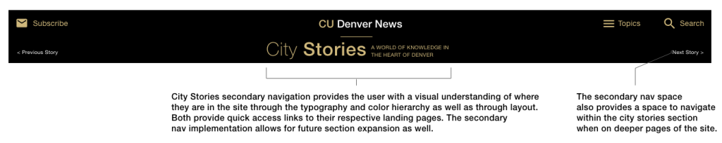
Another aspect of the navigation was the balance between the two branded experiences. How can we serve up “City Stories” to external audiences and “CU Denver News” to everyone else within one navigation?

To accomplish this we created a secondary navigation bar. This navigation bar would appear whenever a user was “within” the City Stories part of the site.


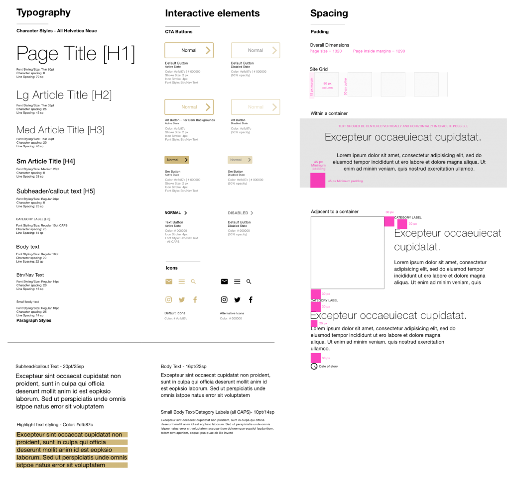
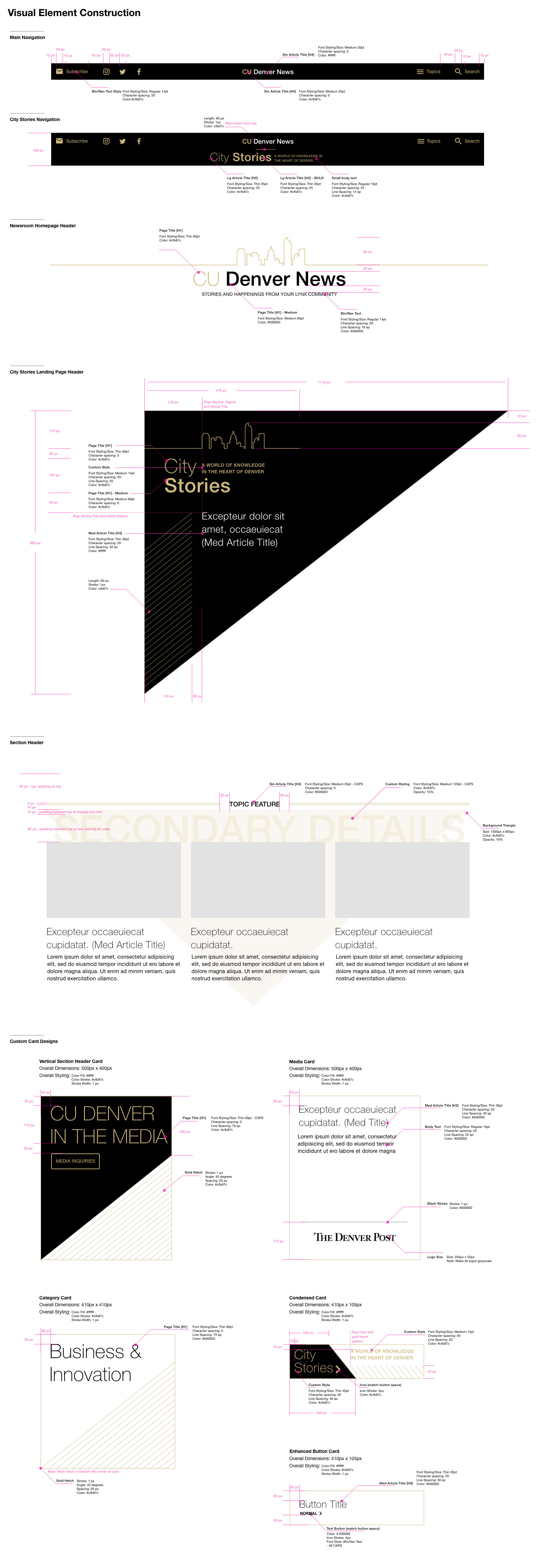
Through visual elements we were able to further differentiate the two sections reversing the dominant color between the two entry pages, making adjustments to the layout and carefully crafting the typographic hierarchy and color scheme.
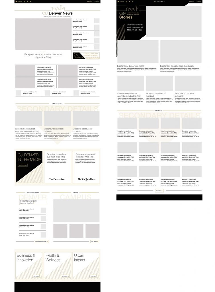
Flexible Layout

Based on feedback received in the focus groups as well as past learnings from the previous site, the new site needed modularity. To have the ability to shift the priority of content sections vertically on the page, create highlight sections for promotional and timely content as well as to add or subtract content based on information obtained were all high value requests. Let’s look into how some of these areas were designed within the layout:

Card System – Modular Construction

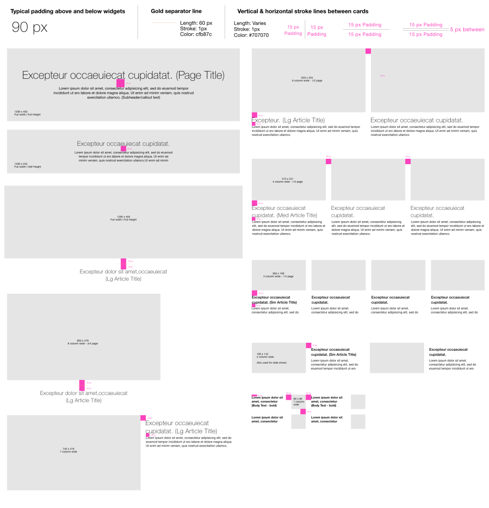
Why are modular layouts
are needed for this site? 

Creating highlight sections for promotional and timely content

To keep the site content relevant to both the university and the outside audiences, content that aligns to the university’s priorities or ties closely to the larger community needed a vehicle to promote it over other content.

Shifting the priority of content sections vertically on the page

As with any large community, information is always changing and priorities are shifting. The challenge is how due we build a site that can shift and adapt with the environment it represents.

Adding or subtracting content based on information obtained

Because of the wide range of sources within the university ecosystem, the same information isn’t always available for all pieces of content so the challenge is how do you have visual consistency with different information?

04

High fidelity wireframes

With two looks within one larger site, the development specs for the site would be critical to building a consistent experience and well functioning site.  With the modular design of the site, details such as spacing between elements were important to define to assure that each modular element paired consistently with each other, 

Distinct Homepage Looks & Layouts

With the communications plans established to direct traffic to the two separate entry pages, we needed to assure that each experience was unique but both felt like complements to a larger whole. Through the simple CU Denver color palette of black, white and gold, the pages were played out and designed to have a high contrast to each other at the top to help the user distinguish where they were entering the site.


The featured content at the top would also cater to the main audiences identified for each page’s main audience, Below the top section, both pages would pull from the same modular sections set up site wide.

05

UX & UI Specifications

With two looks within one larger site, the development specs for the site would be critical to building a consistent experience and well functioning site.  With the modular design of the site, details such as spacing between elements were important to define to assure that each modular element paired consistently with each other, 

Style GUide
Visual element Redlines

06

Live Site

REsults

While we continue to hone our content, the overall traffic numbers and sources over the first year start to tell us how our redesign is performing.


Traffic Numbers

Internal Audiences:

40% Increase

External Audiences:

5% Increase


Traffic Sources:

Search:

222% Increase

 
Direct:

78% Increase

email:

46% Increase