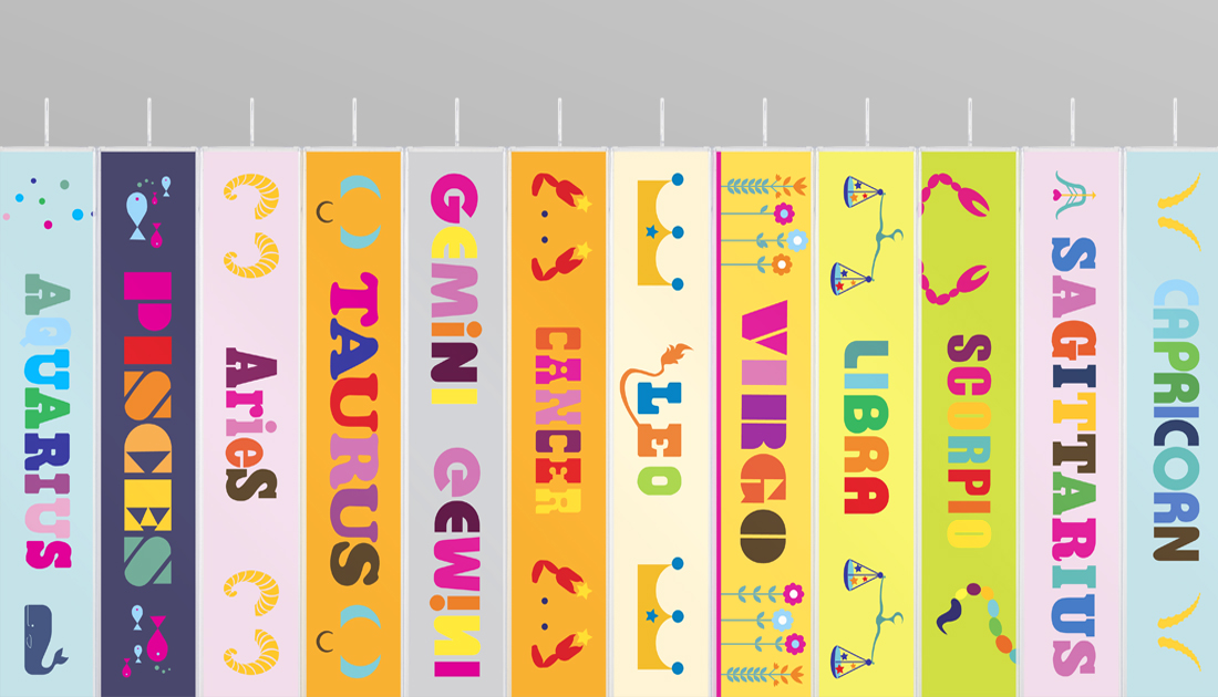
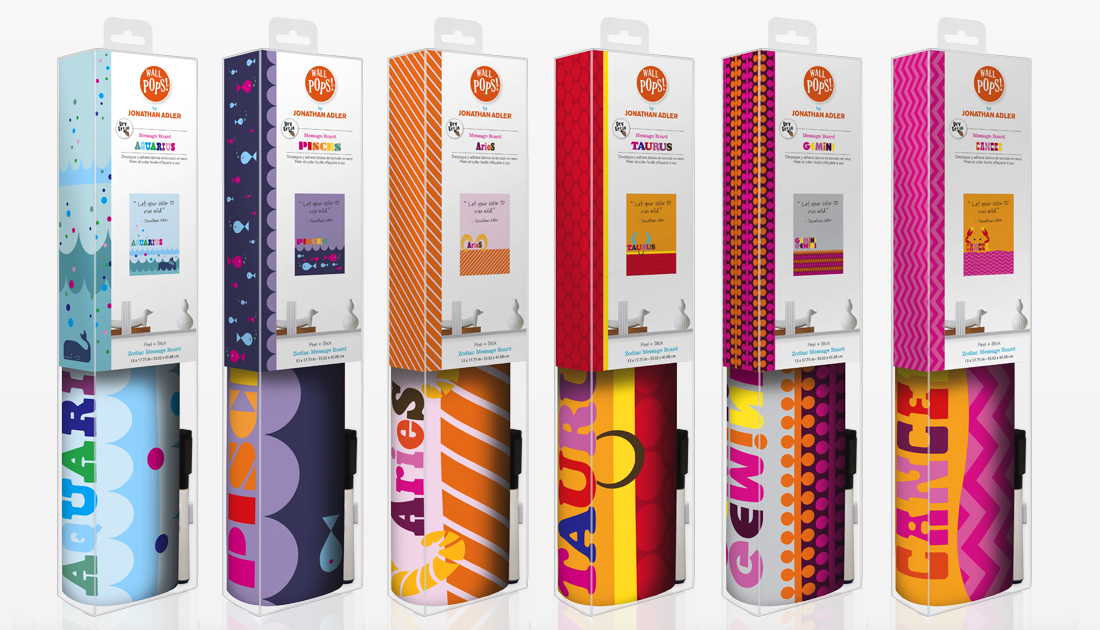
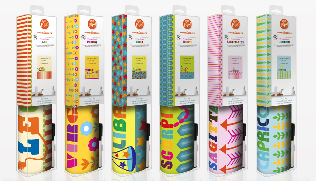
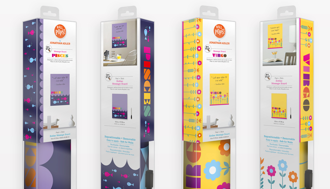
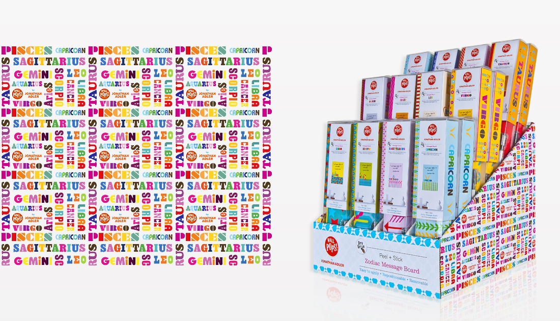
Jonathan Adler is an accomplished textile designer and potter. His bold & colorful geometric textile patterns were a perfect fit for our new WallPops product line. The intricate pattern details and relationships between shapes, forms and colors are what make these designs so special. In addition, adding materials such as gold and silver mylar added a punch of attitude that help these WallPops encompass Adler’s inspiration and attitude.
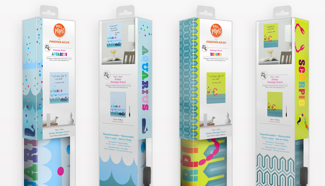
When approached to conceive and design packaging for the new line, I wanted to draw attention to what makes these WallPops different from the main collection. Unlike the packaging of our main line, these inserts needed to be clean and uncluttered so that they wouldn’t compete with the dense colorful patterns of the product. Starting with a white background (instead of our traditional green), I incorporated the individual patterns and colors of each design family allowing each package to be unique. I was able to add unity to the line by using consistent scale and locations for each pattern along with consistent typography. By adding side wings to each insert, I was able to add additional details to help draw attention to the individual patterns. The pattern details also provided a visual connection between coordinating products.
One of the major issues with these inserts was the integration of roomsets. Roomsets are an important part of our packaging allowing customers to visualize how the product would look in their home. The roomsets also help provide scale and relationship between the different pieces in each package. To simplify the roomset concept on the front of the inserts, I pulled the furniture out of the traditional room setting which provided two benefits. It allowed for a cleaner setting without sacrificing scale. It also put more emphasis on the product, bringing it more into the foreground. To further enhance the connection between WallPops and Adler, we used his furniture and pottery on the fronts. The white, starkness of his designs added a funky feel and connection to the designs without stealing focus from the products being featured above. For each product set a new piece of furniture was used helping distinguish one product type from another.


